+ Reply to thread
Page 2 of 2 FirstFirst 1 2
Results 51 to 92 of 92

Thread: The DoMeBo Photography Class - Lesson #4 (Composition)

  1. #51
    Member
    Registered
    Mar 2009
    Location
    San Diego, CA
    Posts
    57

    Default Re: The DoMeBo Photography Class - Lesson #4 (Composition)

    Good Photography?

    Location, lighting, volume, editing, cropping, edit some more. In the past, I was happy if i got two or three shots that I liked out of a 36 exposure roll; now I only discard the worst digital shots. It's funny though, I still take one or two "beginning of the roll" shots on my digital.

  2. #52
    Member
    Registered
    Mar 2009
    Posts
    37

    Default Re: The DoMeBo Photography Class - Lesson #4 (Composition)

    OK, but do you guys just take the same picture over and over? Just try different exposures? Refocus? I mean, what changes do you make, if any, to make sure you get the picture you want?

  3. #53
    Stegodon
    Registered
    Mar 2009
    Location
    Los Angeles
    Posts
    155

    Default Re: The DoMeBo Photography Class - Lesson #4 (Composition)

    Quote Originally posted by Cyberhwk
    OK, but do you guys just take the same picture over and over? Just try different exposures? Refocus? I mean, what changes do you make, if any, to make sure you get the picture you want?
    If your subject is a person or anything else that moves it's never the same picture. If it's a still life, well, I'll take a few to make sure I got one in clear focus and then move the camera to a different angle and take a few more of the same subject so I can compare which angle/framing looks best.

  4. #54
    Stegodon
    Registered
    Mar 2009
    Posts
    143

    Default Re: The DoMeBo Photography Class - Lesson #4 (Composition)

    Quote Originally posted by Cyberhwk
    OK, but do you guys just take the same picture over and over? Just try different exposures? Refocus? I mean, what changes do you make, if any, to make sure you get the picture you want?
    I alter the exposure compensation. It's hard to tell how much detail you're capturing, say in the shadows, on a small screen, or how saturated the colors are overall.

    If your camera allows it you can also manipulate the f/stop to alter how much depth of field you get. 1/250 at f/4 is the same amount of light as 1/500 at f/2.8 or 1/125 @ f/5.6 but the zone of focus will be different on each (as will the amount of 'freezing" the subject). Sometimes you might also change the ISO to get the shutter speed/aperture combination that works best.

    And as Rigamarole points out, sometimes you can frame in/frame out things, play with the perspective.
    My latest photos here: http://picasaweb.google.com/lobotomyboy63

    Major gear: Olympus E520 w/2 AF Zuiko, 3 adapted Minolta MD, Metz Flash, Digital King 0.7x wide angle auxiliary, Slik tripod, Lowepro pack, intervalometer en route, + Canon & Oly PS.

  5. #55
    Elephant
    Registered
    Feb 2009
    Location
    San Jose, CA
    Posts
    513

    Default Re: The DoMeBo Photography Class - Lesson #4 (Composition)

    Quote Originally posted by Giles
    The visual flow is fine, and the thirded older building reflected in between the converging lines of the newer one I like. However, the cars in front kinda throw it off.

    Quote Originally posted by Giles
    This is good. The shooting angle makes it look like the statue is standing on top of the building behind it. The thirding works well to make an interesting composition.

    When cropping, try out weird options. I took your second picture here and cut off almost all the actual statue:
    It put McKinley’s name close to one of the interest points but leaves off the man. It also fills the frame.
    I like your original, Giles; I’m just using it as an example for other student’s future pictures.
    I do not bite my thumb at you, but I bite my thumb.

  6. #56
    Elephant
    Registered
    Feb 2009
    Location
    San Jose, CA
    Posts
    513

    Default Re: The DoMeBo Photography Class - Lesson #4 (Composition)

    Quote Originally posted by chacoguy420
    This 
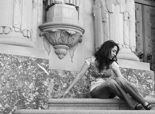
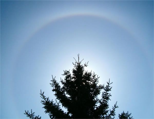
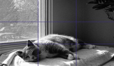
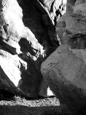
one some of you may have already seen, but I feel it has good flow. You notice the interest points according to the rule of thirds and then, later you notice the periphery like the rocks in the lower right and the flash of light up top.
    It does have good flow. Repeating, flowing organic lines are great for directing the eye around the picture. Here they work in conjunction with the edges of the rock.
    That’s Antelope Canyon, right? I gotta get out there some time.
    I do not bite my thumb at you, but I bite my thumb.

  7. #57
    Elephant
    Registered
    Feb 2009
    Location
    San Jose, CA
    Posts
    513

    Default Re: The DoMeBo Photography Class - Lesson #4 (Composition)

    Quote Originally posted by Dragon
    Bandit in a tree & the agcat. Not the best pictures but what I chose to show what the lesson called for.

    Some adjustments is color intensity (saturation) would help this pop. You could also crop a bit, since there is so much space in there. The subject is more interesting than the composition, but you get the idea.

    Quote Originally posted by Dragon
    Great placement, not only of the cat, but the Y-shaped tree it’s sitting in.
    I do not bite my thumb at you, but I bite my thumb.

  8. #58
    Elephant
    Registered
    Feb 2009
    Location
    San Jose, CA
    Posts
    513

    Default Re: The DoMeBo Photography Class - Lesson #4 (Composition)

    For troubleagain, I’m taking just the ones I like the best and ones I think are close. In most of these, the exposure could use a little boost in contrast. There aren’t any dark blacks. I believe Flickr has contrast adjustments. Or you could download GIMP or a similar program.

    Quote Originally posted by troubleagain
    Very pleasant photo. Perfect balance between the white sun and black bird silhouette, both in position and exposure.


    Quote Originally posted by troubleagain
    Great composition, great thirding of the subjects. I like how both the horse and the girl are on both sides of the fence.


    Quote Originally posted by troubleagain
    This picture is all kinds of awesome. There are multiple textures, there is focus control, there is visual flow (the V shape between the squirrel and tree), there is the rule of thirds, there is filling the frame, and there is a cute subject. Nice work.


    Quote Originally posted by troubleagain
    .
    Both these are good. The contrast between the dark horse and the light person works well. Both pictures use the rule of thirds to good effect.


    Quote Originally posted by troubleagain
    This is a nice shot of an ordinary subject. The dark chair placed in the point of interest makes the shot. However, this is in serious need of a boost in contrast levels.
    I do not bite my thumb at you, but I bite my thumb.

  9. #59
    Stegodon
    Registered
    Feb 2009
    Location
    Columbus, Ohio
    Posts
    275

    Default Re: The DoMeBo Photography Class - Lesson #4 (Composition)

    Quote Originally posted by garygnu
    However, the cars in front kinda throw it off.
    Yes, but unfortunately it's difficult to do much about them, unless you want to wait a long time for the cars to move, or you Photoshop them out of the picture.

  10. #60
    Elephant
    Registered
    Feb 2009
    Location
    San Jose, CA
    Posts
    513

    Default Re: The DoMeBo Photography Class - Lesson #4 (Composition)

    Quote Originally posted by lobotomyboy63
    Do you still want the exposure detail, Gary?
    If you have it and include it, that’s great, but I’m not too concerned with that for this stuff.

    Quote Originally posted by lobotomyboy63
    The placement at the interest points seems OK, but I don’t find this photo compelling. It has the grass in the foreground, but it would be better used if you had the camera right up in that grass. This, with the right aperture setting, would make that grass out of focus. It would become an ambiguous border element.
    I don’t know the layout of the park, but is there a place to stand where you could get that fountain in front of the gazebo?
    The contrast is also flat, which stands is dramatically different in your next photo...


    Quote Originally posted by lobotomyboy63
    The stark contrast and silhouettes really make this picture. I chose this crop version because it highlights that. The tree branches above are a great example of the framing idea I talked about, and they have good texture, too.

    Quote Originally posted by lobotomyboy63
    ...How do you photograph a girl flying a kite? With a lot of uninteresting sky, I guess.

    I think it’s just too difficult to do it without some staging. If there were some clouds you might get a good shot of clouds, but you might lose the kite altogether. If you knew the kite flyer and were able to get closer you could try to get something like a closeup with a low-flying kite behind.
    If you can get a good shot with the spool of string in the hands, you may not even need the kite itself.


    Quote Originally posted by lobotomyboy63
    Also I've been trying to shoot from the hip. Holding the camera at my side, I don't raise it to my eye to compose and I don't even break my stride, hoping to get natural expressions on faces. Here's a heavily cropped image.

    The resulting composition is good, but the blur is distracting. I like the pose.
    Shooting wide angles and cutting a smaller composition from that can work well, but not always. Keep trying it, though, you can get real gems.

    A experimented with messing up the picture to distract from the blur:
    I do not bite my thumb at you, but I bite my thumb.

  11. #61
    troubleagain
    Guest

    Default Re: The DoMeBo Photography Class - Lesson #4 (Composition)

    Thanks, Gary. Those are some of my favorite photos. 
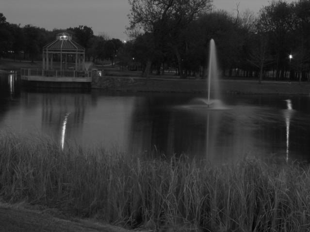
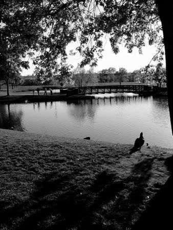
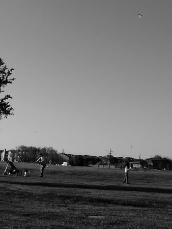
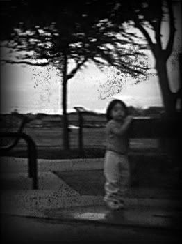
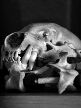
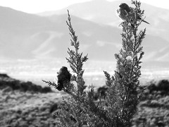
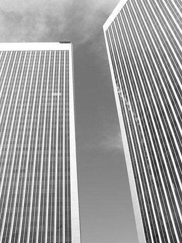
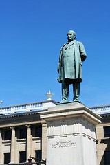
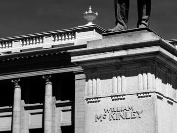
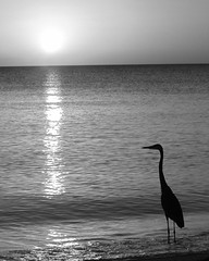
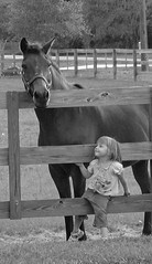
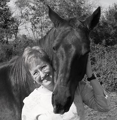
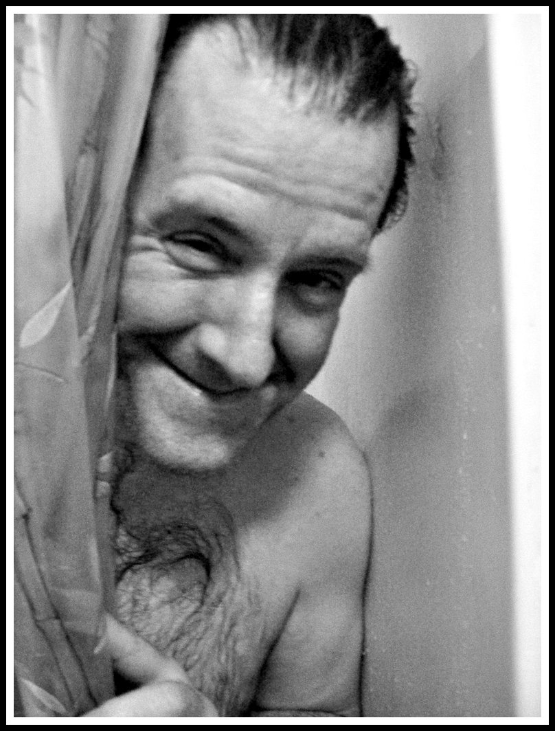
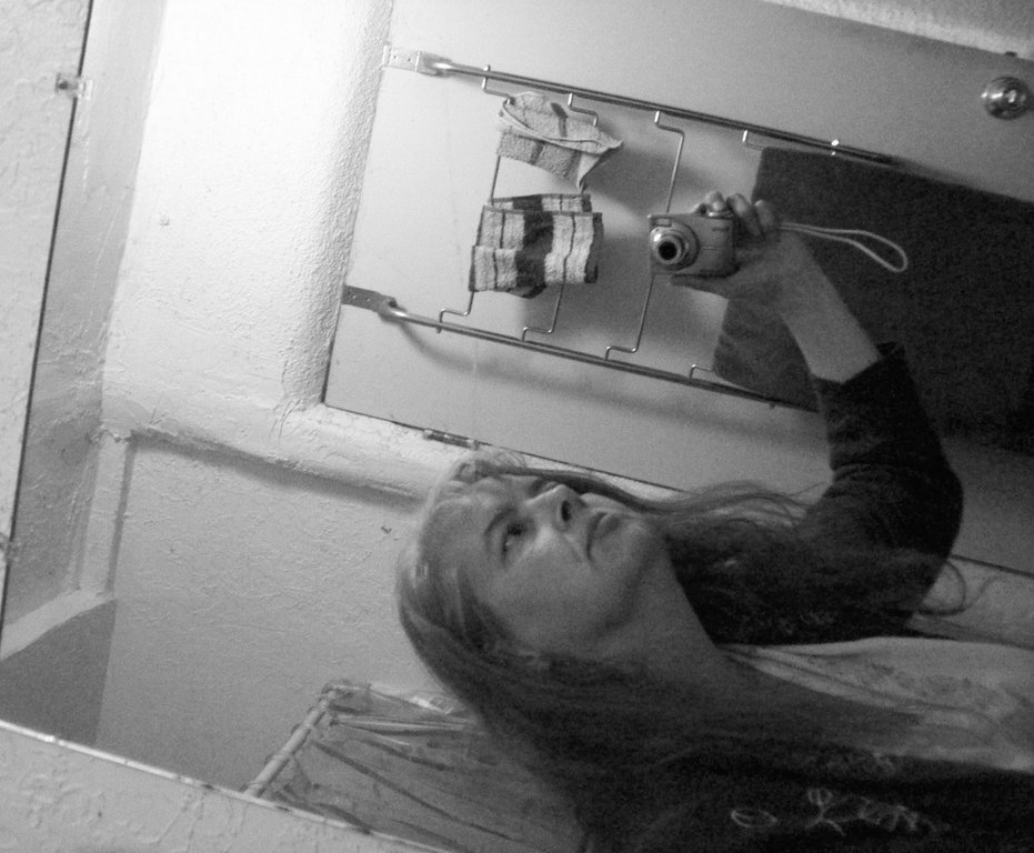
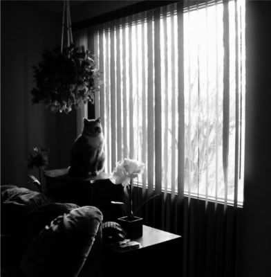
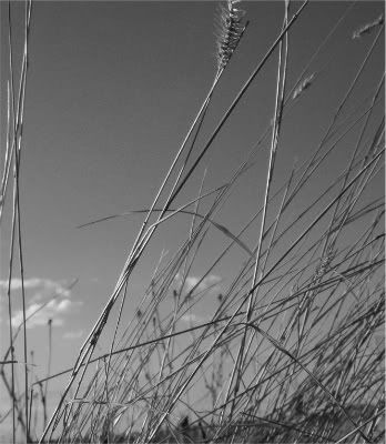
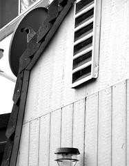
Of course, originally, they were all color. I just made 'em b&w for the "assignment."
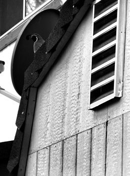
  12. #62
    Elephant
    Registered
    Feb 2009
    Location
    San Jose, CA
    Posts
    513

    Default Re: The DoMeBo Photography Class - Lesson #4 (Composition)

    Quote Originally posted by SmartAleq
    Heh, color me as one confused between "portrait" and "landscape" as "subject matter" rather than "visual alignment!" :

    So: A portrait, in portrait:


    Pardon the grain--I was working with a forced ISO of 800 and no flash in a small, gloss white painted bathroom lighted by a 100 watt CFL. This was desaturated to b/w and I played around with the contrasts a bit to emphasize the contours of his face.
    I love it! Really nice portrait, and the grain doesn’t detract at all, IMHO.The squinting eye is in just the right place.

    Quote Originally posted by SmartAleq
    Then I was just assing around in the mirror and quite by accident took a portrait in landscape--if you rotate it 90 degrees clockwise it's at the proper orientation according to the camera but that removes about every bit of visual interest in the picture. I cropped it a tiny bit on the left to increase the discordant angles of the edge of the mirror with the edge of the frame:

    Interesting, I like it.
    I do not bite my thumb at you, but I bite my thumb.

  13. #63
    Elephant
    Registered
    Feb 2009
    Location
    PDXtc, d00dz!
    Posts
    856

    Default Re: The DoMeBo Photography Class - Lesson #4 (Composition)

    Ooh, cool, glad you like--I've been, like, surgically attached to my camera lately because of these threads, just wanted you to know that! I have pictures of bees...

    @david86blue--you're welcome, glad you liked it...
    "And I hope I don't get born again, 'cuz one time was enough!" -- Mark Sandman

  14. #64
    Elephant
    Registered
    Feb 2009
    Location
    San Jose, CA
    Posts
    513

    Default Re: The DoMeBo Photography Class - Lesson #4 (Composition)

    Quote Originally posted by featherlou
    Working with the law of 2/3s and my favourite subject -
    OK. The thirding isn’t quite right. The cat lines up roughly with the lower horizontal third line, but look at the interest points:
    One is on the shoulder, and the other is on, well, not the subject of the picture, I hope.
    Cropping would work, but I like what you did down below.


    Quote Originally posted by featherlou
    Visual flow - I would improve this picture by removing the hanging plant - it's pretty cluttered on that side.
    I actually like the hanging plant there. It adds texture and balance to the expanse of the vertical blinds and bright window. I really like this picture, even if if it didn’t have the hanging plant. It’s got perspective, framing, balance, and a statuesque cat staring at you.


    Quote Originally posted by featherlou
    Partial picture and balance -
    Nice filling of the frame. In my humble opinion, open eyes would have made this a better picture. Cat’s eye are very expressive, even if barely open. In the picture at the top, the cat’s cheek is squished, but here that effect is diminished somehow.


    Quote Originally posted by featherlou
    Framing -
    Ah! Wonderful framing via presumably artificial means. (I assume the plant was dragged into the shot?) This brackets the cat and blocks the boring window. The leaves also flow and point along the top horizontal third line. Your favorite subject also gives you a boost by lifting his(?) head ever so slightly and putting his eye very close to that lower left interest point. The whiskers are also more brightly backlit here.
    I do not bite my thumb at you, but I bite my thumb.

  15. #65
    Oliphaunt featherlou's avatar
    Registered
    Feb 2009
    Posts
    3,209

    Default Re: The DoMeBo Photography Class - Lesson #4 (Composition)

    I think I forget about the horizontal thirds in favour of the vertical thirds - must remember both. Yup, the plant was placed just where I wanted it. I'm not above creating a shot.

  16. #66
    Elephant
    Registered
    Feb 2009
    Location
    San Jose, CA
    Posts
    513

    Default Re: The DoMeBo Photography Class - Lesson #4 (Composition)

    Quote Originally posted by david86blue

    I just love the short palm tree!
    I have to admit when I first saw this photograph, I didn’t notice the short palm tree. Without that, there isn’t much there. Sometimes a good photograph is simply of something interesting or funny or compelling. Whether it conforms to rule like thirds or filling the frame is immeterial. That being said, though, if the short tree was directly in the center of the line of trees, it wouldn’t be nearly as effective.

    Quote Originally posted by david86blue

    My good friend Richard
    Nice, simple, elegant, and the photograph is nice, too. (insert sound effect)
    The frame is filled, the thirds are on, very good. I’d like to point out here, and we’ll cover it again in the portraits lesson, that generally you will want to have more space on the side of the picture that the subject is facing. Richard here isn’t really facing very far to the right, so it’s not a big deal.
    I do not bite my thumb at you, but I bite my thumb.

  17. #67
    Member
    Registered
    Mar 2009
    Posts
    22

    Default Re: The DoMeBo Photography Class - Lesson #4 (Composition)

    Be Real Have Fun

  18. #68
    Elephant
    Registered
    Feb 2009
    Location
    San Jose, CA
    Posts
    513

    Default Re: The DoMeBo Photography Class - Lesson #4 (Composition)

    Quote Originally posted by featherlou
    . . . .
    The first one works well as an abstract texture study, and has good contrast. It’s a little unclear what the subject is. Part of the problem is that the rocks on the right are closer, but flatly lit, while the rock behind is dramatically lit, but obscured behind something else. Perhaps getting low and shooting up, getting some sky above might work better. (That assumes there was sky available.)

    The second one I like and dislike. It has good depth of field, but lacks a single emphasis point. Maybe getting that tuft near the top into one of those interest points. The ratio of texture (the grass) to untextured (the sky) should be reversed. I think getting the horizon more in-picture would help. Ideally it’s along the horizontal third line, or close. It barely straddles the edge of the picture here.
    Still, It is a nice picture.


    ---


    Sorry this lesson is taking so long, everybody. It’s important and people are submitting many good pictures.
    Plus, I’ve had a bunch of drama to deal with in real life. Life’s lesson: be very careful picking apartment tenants.
    I do not bite my thumb at you, but I bite my thumb.

  19. #69
    Oliphaunt featherlou's avatar
    Registered
    Feb 2009
    Posts
    3,209

    Default Re: The DoMeBo Photography Class - Lesson #4 (Composition)

    Quote Originally posted by garygnu
    Quote Originally posted by featherlou
    . . . .
    [color=#000000][size=110]The first one works well as an abstract texture study, and has good contrast. It’s a little unclear what the subject is. Part of the problem is that the rocks on the right are closer, but flatly lit, while the rock behind is dramatically lit, but obscured behind something else. Perhaps getting low and shooting up, getting some sky above might work better. (That assumes there was sky available.)<snip>
    That's a picture of a really cool glacial erratic that is split right up the middle - I knew there was an interesting picture in it, but I don't think I quite found it. Maybe I'll go back to that rock and mess around some more.

    Thanks for all the feedback, by the way. It really helps to know what is working and what isn't.

  20. #70
    Stegodon
    Registered
    Mar 2009
    Location
    The Biggest Little City in the World (Sort of)
    Posts
    300

    Default Re: The DoMeBo Photography Class - Lesson #4 (Composition)


    This photo is strictly an experiment (gary et al., feel free to comment but don't consider it part of my assignment. ). I had to go downtown to pick something up, and I took a handful of shots out the car window without looking while I was down there, just to bring them back and see if I could then turn the shots into something interesting via cropping. I think I succeeded on this one; the vertical lines are out of true on purpose.
    Aunt Em - Hate you, hate Kansas, took the dog - Dorothy.

  21. #71
    Elephant
    Registered
    Feb 2009
    Location
    San Jose, CA
    Posts
    513

    Default Re: The DoMeBo Photography Class - Lesson #4 (Composition)

    Quote Originally posted by sistercoyote
    I am not entirely happy with any of these, just for the record:

    Portrait:

    For those who are curious, that's a badger skull and coyote vertebrae. Both were gifts.
    The first one has too much empty space right in the middle of the frame. It took me a while to spot the quail. Cropping would work to correct that. The light fixture at the bottom doesn't need to be there, so I’d cut it off a little above that. The other two are good still lifes. The first works a bit better because it emphasizes the texture in the nasal cavity and avoids the washed-out look the second one has.
    The overall exposure levels are very good. However, with the right editing tools, you can bring out the texture detail in both the wood paneling of the building and the skull in the two sill lifes. A process call dodging and burning does digitally what once was done manually in the darkroom. Dodging lightens and burning darkens. Photoshop and GIMP have these tools, perhaps those who have used other image manipulation programs can chime in about other options. Setting for the two include how much of a change to make (exposure %) and what tone level to change (highlights, midtones, or shadows). Below I burned the flat, overexposed ares of two of the above pictures:
    . . . . . . . . . .
    Please note that I’m not a wizard at the process, which can be quite manually intensive. I just did these real quick without being too careful about it.


    Quote Originally posted by sistercoyote
    Landscape:
    The first one is very nice. It loses a little bit when it gets scaled down this much though. Here:
    The top right bird is maybe just little too high and the tip of that branch might have been nice to have inside the frame, but overall I like it. The darker background line makes a horizon at the right place in the frame, which works with the vertical lines of the plant.
    Next time tell the lower bird to turn around.

    The second one of the quail on the roof is, uh, meh.
    I do not bite my thumb at you, but I bite my thumb.

  22. #72
    Stegodon
    Registered
    Mar 2009
    Location
    The Biggest Little City in the World (Sort of)
    Posts
    300

    Default Re: The DoMeBo Photography Class - Lesson #4 (Composition)

    Yeah - I really wasn't thrilled with the quail on roof picture, but nothing else I shot came out satisfactorily, either.

    I had forgotten photoshop has a Dodge and Burn tool. What I really need to do is dodge around the quail so he's more visible against the satellite dish.

    Thanks!
    Aunt Em - Hate you, hate Kansas, took the dog - Dorothy.

  23. #73
    Elephant
    Registered
    Feb 2009
    Location
    San Jose, CA
    Posts
    513

    Default Re: The DoMeBo Photography Class - Lesson #4 (Composition)

    Quote Originally posted by Cyberhwk
    I only had access to some of the most boring subjects in the world.

    Framing:


    F7.1, 1/500, ISO100

    Tried to get the trunk of the tree and the branches over the top as the frame. As I mentioned above I seriously lacked decent subjects. Didn't work out exactly like I would have hoped.
    I wanted these in black and white. However, in this case, the purple flowers don’t translate well to greyscale. You get the idea, at least. Boring subject aside, you have the car at the interest point and foreground framing elements. The point is to remember this concept when you have the opportunity to shoot something more intriguing, like on vacation.

    Quote Originally posted by Cyberhwk
    Rule of Thirds Horozontal:

    Large
    F2.3, 1/6, ISO100, Exposure Bias -.7

    A little oil candle thingy. This picture kept overexposing with the flash which was why I brought it to -.7EV.
    Easy access to exposure bias is nice. One more way to bully around the camera’s stupid processor. Your thirding is fine, even in greyscale.


    Quote Originally posted by Cyberhwk
    Rule of Thirds Horozontal:

    Large
    F2.5, 1/2, ISO100, Exposure Bias -.7

    The best of the ones I took. The further turtle seems to be JUST on the edge of the depth of field, but I love the way the color stands out.
    Again with the color!?
    It does pop nicely. One thing I talked about in a post above that I forgot about in composition is the need to leave space in front of a face. In general you will want a face to be looking into the middle of the frame. Here you have both figures on the left and looking left, with empty space behind them. Put that empty space in front of them.
    The depth of field is fine. It’s inevitable for such small objects, so as long as the head is in focus, you’re good. One big drawback of the LCD screens on point-and-shoot cameras is that it makes it hard to see the focus.


    Quote Originally posted by Cyberhwk
    Rule of Thirds Vertical:

    Large

    There were other little votives beyond the three I got and it was hard keeping them out of the picture. The blue candle was a little closer to center than I would have liked (probably error in the display) but I tried to put it down the left "thirds" axis.
    Nothing a little cropping can’t fix. There once was an issue with old cameras’ viewfinders not matching up very well to the resulting photographs. I didn’t expect it with a digital display.
    There’s some serious vertical perspective going on there, or is the blue candle really that much smaller on the bottom? It’s a neat effect you can get with wide-angle lenses when you use them on closeups.


    QUESTION: To the more experienced photographers...how do you shoot a subject you like? To you tend to take multiple exposures in case one is off? I know my camera has a "bracketing" function where it will exposure up and down a stop, do you do this also? I've been finding myself being a little disappointed lately thinking a I had a shot, then when I get it on the computer, I find out I didn't (the turtles).
    As I said earlier to this question, you can take multiple picture with different settings to get it just right. I remember taking pictures of some waterfalls in a county park over and over and over with different shutter speeds to get the flowing water effect just how I wanted it.
    If you have the ability to adjust exposure levels in post-production, lean towards a slightly underexposed shot. I find it easier to brighten them than to try to fix an overexposed shot.
    I do not bite my thumb at you, but I bite my thumb.

  24. #74
    Member
    Registered
    Mar 2009
    Posts
    37

    Default Re: The DoMeBo Photography Class - Lesson #4 (Composition)

    I must have missed the memo.

  25. #75
    Stegodon
    Registered
    Feb 2009
    Location
    Columbus, Ohio
    Posts
    275

    Default Re: The DoMeBo Photography Class - Lesson #4 (Composition)

    Quote Originally posted by garygnu
    There’s some serious vertical perspective going on there, or is the blue candle really that much smaller on the bottom? It’s a neat effect you can get with wide-angle lenses when you use them on closeups.
    I take a lot of pictures of buildings, and converging verticals is a common problem here, especially when you can't get far enough away from a building because another building is there. Of course, you can let the converging verticals just happen, as here:

    or you can use Photoshop or a similar package to correct the verticals (though there's only so much that can be done in extreme cases).

    But my solution is to use my wide-angle 10-20 mm zoom (equivalent to 16-32 mm on a 35 mm camera), holding it in portrait orientation and at the10 mm end of the zoom, so that the building is in the top 2/3 of the picture, planning to crop the bottom 1/3 of the picture, and leaving a square picture like:

    (Note that the vertical lines are still converging a bit -- that could be corrected in Photoshop, but it looks reasonably natural for a picture taken from ground level).

  26. #76
    Stegodon
    Registered
    Mar 2009
    Location
    Los Angeles
    Posts
    155

    Default Re: The DoMeBo Photography Class - Lesson #4 (Composition)

    You seemed to have skipped over mine, could you give me some feedback please? Thanks.

  27. #77
    Elephant
    Registered
    Feb 2009
    Location
    San Jose, CA
    Posts
    513

    Default Re: The DoMeBo Photography Class - Lesson #4 (Composition)

    Ack!
    I had considered these, and had thoughts on both all ready to go. How did I not post them?
    I apologize.

    Quote Originally posted by Rigamarole

    I had the good fortune of having a beautiful model for this photo (my girlfriend).
    Good composition, placement, shooting angle, pose. Very nice.
    The only thing I would complain about is that the granite(?) stone along the bottom of the building blends into her shirt in a visually confusing way. This may not have been a problem in color, but in black and white things like this pop up with enough regularity that one should keep it in mind if black-and-white is the intended result.


    Quote Originally posted by Rigamarole
    This works well as an abstract photo. The negative space, that is, the space between the buildings, is a little centered. No big deal for this, I think.

    Side note: If you have an SLR or a fancier point-and-shoot that will accept filters, a vital one to have is a circular polarizer. Among a few other tricks, you can use it to deepen the blue of the sky to a level you like by rotating it. In black-and-white photography, you can often use it to decide whether a single shot should have a light object against a dark sky, or a dark object against a light sky.
    See this comparison pic from Wiki Commons to see the difference it can make.
    I do not bite my thumb at you, but I bite my thumb.

  28. #78
    Stegodon
    Registered
    Mar 2009
    Posts
    143

    Default Re: The DoMeBo Photography Class - Lesson #4 (Composition)

    Quote Originally posted by Giles
    ...my solution is to use my wide-angle 10-20 mm zoom (equivalent to 16-32 mm on a 35 mm camera), holding it in portrait orientation and at the10 mm end of the zoom, so that the building is in the top 2/3 of the picture, planning to crop the bottom 1/3 of the picture, and leaving a square picture like:

    (Note that the vertical lines are still converging a bit -- that could be corrected in Photoshop, but it looks reasonably natural for a picture taken from ground level).
    1.6X = you're shooting with Canon, right?

    Yeah, that second shot looks pretty good IMO. You could push that technique further, confining the subject to an even smaller portion of the center. Since distortion is worst at the edges hopefully you'd get more improvement. IIRC the main thing is to keep the plane of the film/sensor as parallel to the plane of the facade as possible.

    If you're willing to throw some $ at the problem, a TS-E lens....

    http://www.adorama.com/searchsite/defau ... info=Canon TS-E

    I also managed to find this, a place that lets you rent them. Sounds like a great idea to me. If you had a bunch o'buildings to photograph in a short period of time, or if you just wanted a test drive before ponying up big bucks:

    http://www.borrowlenses.com/category/canon_macro
    My latest photos here: http://picasaweb.google.com/lobotomyboy63

    Major gear: Olympus E520 w/2 AF Zuiko, 3 adapted Minolta MD, Metz Flash, Digital King 0.7x wide angle auxiliary, Slik tripod, Lowepro pack, intervalometer en route, + Canon & Oly PS.

  29. #79
    Elephant
    Registered
    Feb 2009
    Location
    San Jose, CA
    Posts
    513

    Default Re: The DoMeBo Photography Class - Lesson #4 (Composition)

    I’ve had a large amount of real-life stuff on my plate recently causing delays in the next lesson. I haven’t forgotten.
    Sorry for the wait, everybody.
    I do not bite my thumb at you, but I bite my thumb.

  30. #80
    Stegodon Dragon's avatar
    Registered
    Mar 2009
    Location
    Central Arkansas
    Posts
    335

    Default Re: The DoMeBo Photography Class - Lesson #4 (Composition)

    No problem, we been being rowdy in the classroom an the principal is pissed....
    No job is too hard for the person who does not have to do it.

  31. #81
    Stegodon
    Registered
    Mar 2009
    Location
    The Biggest Little City in the World (Sort of)
    Posts
    300

    Default Re: The DoMeBo Photography Class - Lesson #4 (Composition)

    I did not set that bomb!

    Dragon did it.
    Aunt Em - Hate you, hate Kansas, took the dog - Dorothy.

  32. #82
    Stegodon
    Registered
    Mar 2009
    Posts
    143

    Default Re: The DoMeBo Photography Class - Lesson #4 (Composition)

    The teacher's coming...everybody look busy!

    I don't know where I picked up the info---probably over on the dope---but Ritz has filed for bankruptcy. I went into their website to see what kind of [del:18uqco9a]steals[/del:18uqco9a] deals I might get from their circular. Nothing much floated my boat except they had a deal, three 8 x 10s for $5. So I ordered them, picked them up today.

    You know how something can look really good on screen but then the print...? Well that did NOT happen. They look pretty good! Had these three made:

    (Taken with new EVOLT)


    (Taken with Canon A720IS)


    (Taken with Olympus E350) I'm impressed as hell with how good this print looks. I cropped a horizontal shot to get it, cutting way down on the pixels etc.
    My latest photos here: http://picasaweb.google.com/lobotomyboy63

    Major gear: Olympus E520 w/2 AF Zuiko, 3 adapted Minolta MD, Metz Flash, Digital King 0.7x wide angle auxiliary, Slik tripod, Lowepro pack, intervalometer en route, + Canon & Oly PS.

  33. #83
    Stegodon
    Registered
    Mar 2009
    Location
    The Biggest Little City in the World (Sort of)
    Posts
    300

    Default Re: The DoMeBo Photography Class - Lesson #4 (Composition)

    I've posted a couple I'm really proud of over on the "Nature photos..." thread.

    But here's one of the Nanamadog that I can't quite figure out why I find it so appealing:


    I have got to nag flickr to do vbulletin-friendly coding.

    Also, my flickr photostream, for anyone interested, is here. Since I like my sig and don't want to be bothered to change it.
    Aunt Em - Hate you, hate Kansas, took the dog - Dorothy.

  34. #84
    I put the DU in DUMBO. Dangerously Unqualified's avatar
    Registered
    Mar 2009
    Posts
    397

    Default Re: The DoMeBo Photography Class - Lesson #4 (Composition)

    I haven't been participating due to waiting to get a camera (and not just a borrowed one either). I have one now so here are a couple of contributions for composition:

    The first is a lilly my wife bought last weekend:

    The second is the same lilly in B&W:


    The second lilly is still compelling to me without color.

    I hope to have landscapes and a portrait by the weekend.

  35. #85
    Oliphaunt featherlou's avatar
    Registered
    Feb 2009
    Posts
    3,209

    Default Re: The DoMeBo Photography Class - Lesson #4 (Composition)

    Quote Originally posted by sistercoyote
    I've posted a couple I'm really proud of over on the "Nature photos..." thread.

    But here's one of the Nanamadog that I can't quite figure out why I find it so appealing:


    I have got to nag flickr to do vbulletin-friendly coding.

    Also, my flickr photostream, for anyone interested, is here. Since I like my sig and don't want to be bothered to change it.
    I really like that picture, too - maybe it's the story it's telling - sleepy dog, lying on the floor, just nodding off. It's got great texture and contrast, too.

  36. #86
    Oliphaunt featherlou's avatar
    Registered
    Feb 2009
    Posts
    3,209

    Default Re: The DoMeBo Photography Class - Lesson #4 (Composition)

    I want to post this picture everywhere - I'm so pleased with how it turned out -


  37. #87
    Member
    Registered
    Mar 2009
    Posts
    37

    Default Re: The DoMeBo Photography Class - Lesson #4 (Composition)

    Nice. Did you know the lens flare was there when you took it or was it unintentional? Adds quite a bit to the picture.

  38. #88
    Oliphaunt featherlou's avatar
    Registered
    Feb 2009
    Posts
    3,209

    Default Re: The DoMeBo Photography Class - Lesson #4 (Composition)

    That's a picture of a huge ring around the sun - is that the lens flare you mean?

  39. #89
    Stegodon
    Registered
    Mar 2009
    Location
    The Biggest Little City in the World (Sort of)
    Posts
    300

    Default Re: The DoMeBo Photography Class - Lesson #4 (Composition)

    Quote Originally posted by featherlou
    I really like that picture, too - maybe it's the story it's telling - sleepy dog, lying on the floor, just nodding off. It's got great texture and contrast, too.
    Thanks!

    I think the photo of the sun behind the tree with ring is awesome.
    Aunt Em - Hate you, hate Kansas, took the dog - Dorothy.

  40. #90
    I put the DU in DUMBO. Dangerously Unqualified's avatar
    Registered
    Mar 2009
    Posts
    397

    Default Re: The DoMeBo Photography Class - Lesson #4 (Composition)

    My portrait picture. This is our oldest in her prom dress.


  41. #91
    Member
    Registered
    Mar 2009
    Posts
    37

    Default Re: The DoMeBo Photography Class - Lesson #4 (Composition)

    Quote Originally posted by featherlou
    That's a picture of a huge ring around the sun - is that the lens flare you mean?
    Yes.

  42. #92
    Stegodon Papaw's avatar
    Registered
    Mar 2009
    Location
    Texas
    Posts
    208

    Default Re: The DoMeBo Photography Class - Lesson #4 (Composition)

    In close-ups, composition sometimes makes you bend the "Rule of Thirds" .
    I think this shot fits, though.

    Vintage Wrench Collector Tool Talk
    Photographer My Flickr
    PapawsImages
    Brazoria County Forum

+ Reply to thread

Posting rules

  • You may not post new threads
  • You may not post replies
  • You may not post attachments
  • You may not edit your posts